Hey gang! This is a newsletter about Poem/1, the AI rhyming clock — telling the time with a new ChatGPT poem every MINUTE on a gorgeous e-paper screen. You’re getting this email because you subscribed for updates. If you need it, the unsubscribe link is at the bottom of this email. If you’re along for the ride, thank you :)
Ok we all know what we’re here for.
I’ve been working on this clock since the March 2023 prototype went unexpectedly whaaaaa.
Nobody knows what the product looks like.
Until today.
So let’s get right to it.
Hullo!
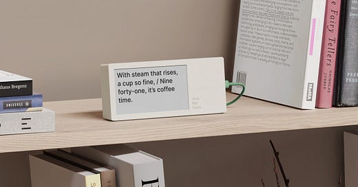
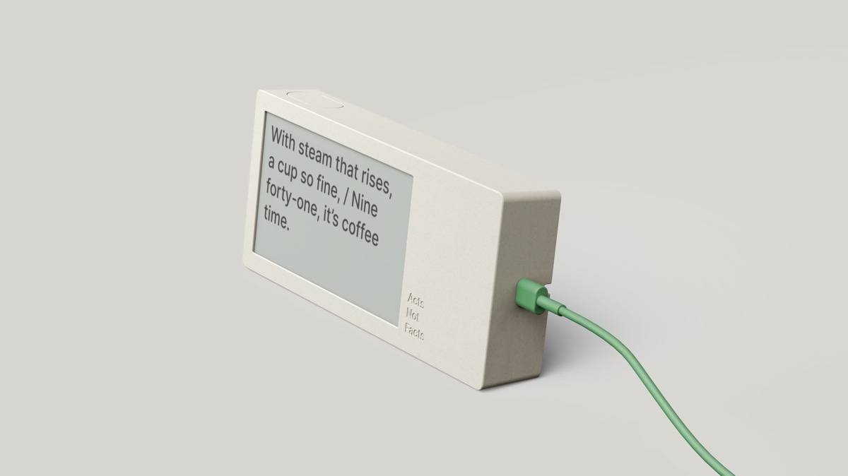
That is a render of the actual CAD of course. Here’s a 3D printed version still warm out of its birthing pod, so you can get a sense of the scale and shape.
Let me tell you about who I’ve been working with, the thinking, and some of the design details.
Approach Studio
I am very lucky to be collaborating with London industrial design studio Approach.
(Check out their projects! Soooo gorgeous.)
I turned up at Approach with a prototype, and a deck of references and aspirations. There’s a lot to figure out — like, how weird should this be? How does it hang together as a coherent product that celebrates words?
And also MANUFACTURABILITY. There’s a lot going on.
Someday I will show you the sketches. For now, the end result.
I have loved working with Approach and their process.
To talk you through the features and decision, let’s zoom in.
Features
I can’t resist e-paper. E-ink is the old school version of this, but it has a slow refresh rate and the slow flashing is distracting. E-paper updates faster like a new Kindle and it shares the e-ink quality in that it doesn’t glow so it takes on the hue of your room.
And that’s what you want out of a clock on your shelf, right? It shouldn’t forcibly grab your attention by glowing or flashing.
E-paper screen — the text sits on the surface
Wi-Fi — the first time you turn on Poem/1, the screen shows a QR code: connect to the clock to set your Wi-Fi details
USB-C power — we’ll supply a cable (but not a wall plug, people have a ton of those already)
And it is this handsome off-white shade that will just look great displayed anywhere in your home.
It’s like a little poster that tilts up to look at you
Let me say something about the proportions and the shade.
We tried dramatic colours. We tried weird and 80s throwback and in-your-face. Here’s what I learnt from those design explorations:
ONE: this is already a weird device. It’s a device that tells the time with RHYMING COUPLETS! It’s a MACHINE POET that lives on my frickin BOOKSHELVES composing tirelessly and INFINITELY. Anything apart from the poetry that yells for attention distracts from that. Hence, appliance beige :)
TWO: yet… fundamentally it’s a screen in a box, and that’s a challenge. We’re surrounded by TVs and phones and a screen, any kind of screen, unconsciously reminds us of both. Oh, this is a bigger design problem than it sounds.
See, it’s odd but when you see a screen in a box, or something slim and shaped like a smartphone, your first instinct is to either pick it up or wait for CONTENT. The blight of our age is CONTENT. A screen in a box can show anything, “CONTENT.”
But Poem/1 doesn’t show CONTENT. It tells the time with poems. Just that one thing. And if, in your monkey brain, you are expecting CONTENT then, well, you don’t read. Your eyes don’t focus quite right. You don’t see the words.
The answer:
The breakthrough came in treating this more like poster design than product design.
It’s a typographic exercise, right? If you were designing a postcard and your client said: well it has to have a bunch of words in a fixed-size green-grey box, you would be (a) super rolling your eyes at this ridiculous client brief; and, (b) you would begin layout by considering the shape of the text and the optical edges and balance and so on.
So that’s how we got to that elongated shape, and that’s my studio name Acts Not Facts debossed on the front too.
Freestanding or wall-mounted, your choice
You’ll also notice in the side view that Poem/1 is deep.
Not just deep, but the lower side of the case has a subtle wedge-shaped foot.
So the clock is freestanding, and it leans back a little to look at you when it’s on your shelf.
BUT we found when showing this around that a lot of people would like the clock on their wall. Now, this is tricky because the device is actually pretty small - perfect for shelves or a desk - but ok I can see it working on a wall… except for the power cable.
How to hang Poem/1 on a wall:
There’s a built-in hole to hang the clock (woo built-in hole! We may end up with two of these depending on weight distribution)
So that the cable can run up to the clock symmetrically in the middle, there’s a gully. The cable runs along the gully and then doubles back to use the side port.
We looked at hiding the cable — the idea of looping it visibly is strange, right?
But our principle for this product is honest. The idea of AI is so perplexing you know? The very concept of what it does, so alien. So the physical thing itself has to um wear itself on its sleeve, I don’t know I’ve expressed myself badly here? Physically it needs to be comprehensible, that’s what I mean. If the cable needs to loop then show the loop.
So that’s what Approach did and I love it.
The cable is ‘AI green’
Have you noticed that the canonical colour of AI is green?
Like, Poem/1 composes poetry using the same large language model behind ChatGPT. And all the ChatGPT ripoffs on the App Store are mint green or forest green.
When you use OpenAI’s developer Playground (which is I spend my time to experimenting with prompts), the AI generated text is distinguished with a green background colour.
If there’s a colour of our AI future I reckon this is it.
look the usb-c cable in the box is green that’s what i’m saying.
When’s the Kickstarter?
Next week 🙈
I’ll give you a heads-up the day before.
In the meantime, please do this for me:
👉 FOLLOW POEM/1 ON KICKSTARTER
It’s the Kickstarter pre-launch page! I’ve just activated it!
On that page you can follow the project to get notified as soon as the campaign launches. And the more people who follow, the more attention we’ll get. Which is a good thing. Because then it’s more likely that the campaign succeeds.
So please also TELL YOUR FRIENDS.
Do go check out Approach studio. It’s a joy working with them.
Till next week,
Matt x
p.s. you can find me as @genmon on X/Twitter, Threads and Insta. My personal blog is Interconnected. I will be banging on about Poem/1 in all of those places too.


